🎓 [archived] Insights from students data
Recently (well, a month ago) I had a discussion with a friend of mine about the modern tools and approaches in education. He is currently involed to the edX platform startup, and given that I am assistant at the university, we had several points to discuss.
Disclaimer: This post is outdated and was archived for back compatibility: please use with care! This post does not reflect the author’s current point of view and might deviate from the current best practices.
Perhaps the key point of the discussion was how to analyse the students’ data. Currently educational platforms, such as moodle for instance, has terabites of data. However, it’s a challange to extract insights from it. As long as I have an access to the moodle data of our courses, I made a brief investigation what could be drawn from such a piece of data (unfortunately, due to the data protection policy of our university I cannot share it).
The first data set is the moodle’s logfile, i.e. the time and other information of students’ logins and other activities/actions. The second one is the midterm grades.
First, we load the data to the global enviroment. Variables exercises, before_exercises, and midterm contain dates of excercise sessions, when such exercises were published in moodle and the date of midterm, respectively. The column Time stores data as character, which is transformed to POSIXct format. Also, it is useful to store the dates (without the time) in a separate column. Furthermore, we focus only on the semester time period, not on Christmas break nor exam period. The semester ends on December 23.
library("ggplot2")

log_alm <- read.csv(file = "/Users/irudnyts/Documents/Data/alm_logs.csv",
                    stringsAsFactors = FALSE)

exercises <- as.Date(c("2016-10-18", "2016-11-02", "2016-11-16", "2016-12-07"))
before_exercises <- exercises - 7
midterm <- as.Date("2016-11-23")

colnames(log_alm) <- tolower(colnames(log_alm))
log_alm$time <- as.POSIXct(strptime(log_alm$time, "%d/%m/%y, %H:%M"))
log_alm$date <- as.Date(log_alm$time)

log_alm <- log_alm[log_alm$date < as.Date("2016-12-23"), ]
It is possible to depict immediately the frequency of student’s action.
ggplot(data = log_alm) + geom_bar(aes(x = date))
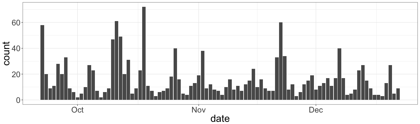
Note that if a student logins two times on the same day, these events are considered as distinct. Thus, this plot is not very helpful, ‘cause we need to figure out how many different students attend the web-page during the day. The possible way how to aggregate the data is shown below (even though, it is not the most elegant one):
smr <- data.frame(date = unique(log_alm$date), n_logins = NA)

for(date in unique(log_alm$date)) {
    smr[smr$date == date, "n_logins"] <- length(unique(log_alm[log_alm$date == date,
                                                                "user.full.name"]))

}

smr$class <- "no_class"
smr$class[weekdays(smr$date) %in% c("Tuesday", "Wednesday")] <- "lecture"
smr$class[smr$date %in% exercises] <- "exercise"
smr$class[smr$date %in% before_exercises] <- "before_exercise"
smr$class[smr$date == midterm] <- "midterm"
Additionaly we mark the dates depending on whether it was a lecture, exercise session, etc. Now we can plot it:
ggplot(data = smr, mapping = aes(x = date, y = n_logins)) +
    geom_bar(aes(fill = class), stat="identity")
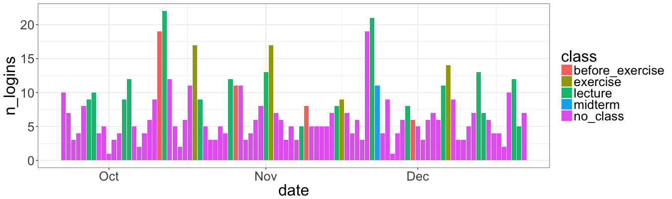
The plot is a bit more illustrative that the previous one:
-
The peak on October 11 and the day after indicates the interest of students about the first exercise session.
-
The second peak is right before the midterm. That’s also along with intuituion: students tend to study right before the exam.
-
First two exercies sessions show the same frequency, while we see the drop in the third one. Typically it is due to the overload during the midterm semester period.
Perhaps the line chart might be also useful to see the trend:
ggplot(data = smr, mapping = aes(x = date, y = n_logins)) +
    geom_line() +
    stat_smooth(method ="auto", level = 0.95, span = 0.4)
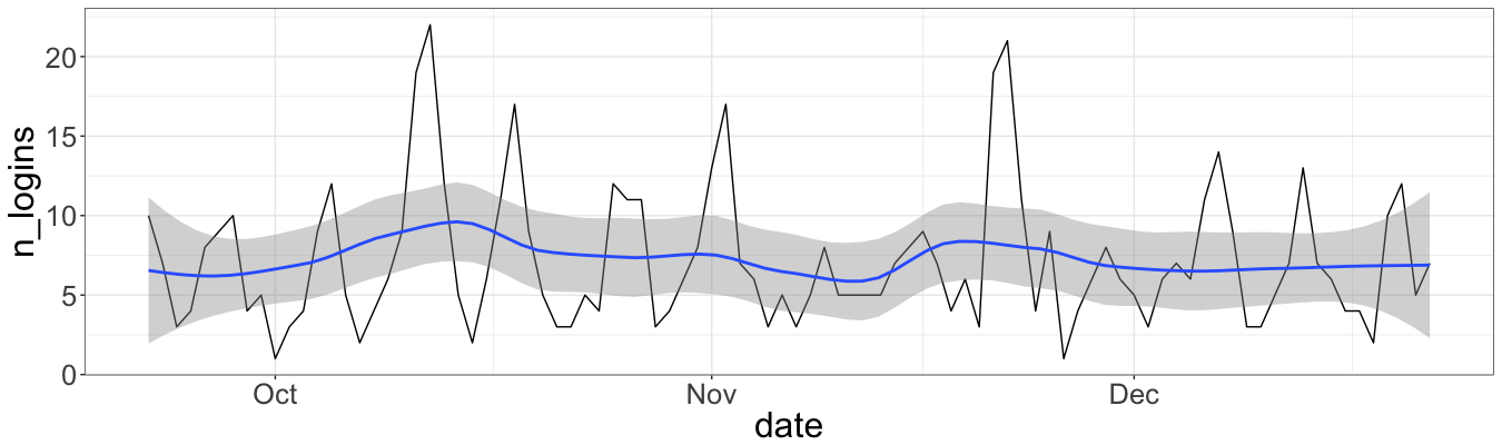
This figure shows that the trend is quite linear, with two peaks of the first exercise and the midterm. After the midterm the line is even more stable and predictable.
To dive a bit deeper is possible thanks to midterm grades. Also we give a “joker” to students, namely: if they do a presentation, they got a bonus for a final grade. This “joker” together with midterm grades are stored in seprate file. Therefore, the next objective is to extract a relevant information about the login numbers for each student, and then merge it with the grades and “joker”:
std <- sort(table(log_alm$user.full.name))
std <- data.frame(name = names(std), logins = std)
std$name <- tolower(std$name)

grades <- read.csv(file = "/Users/irudnyts/Documents/Data/alm_grades.csv")
colnames(grades) <- c("id", "surname", "name", "grade", "pres")
grades$name <- tolower(paste(grades$name, grades$surname))

info <- merge(grades[, c("grade", "name")],
              std,
              all = TRUE)

info <- info[complete.cases(info), ]
info <- info[info$grade != 0, ]
Let’s run the regression, to see whether or not number of logins drive the midterm grade (we account only on those student, who have written midterm, i.e. with non-zero grades):
model <- lm(info, formula = grade ~ logins)
summary(model)
Call:
lm(formula = grade.midterm ~ logins, data = info[info$grade.midterm !=
    0, ])

Residuals:
    Min      1Q  Median      3Q     Max
-2.9317 -0.3541  0.2658  0.5813  1.5943

Coefficients:
            Estimate Std. Error t value Pr(>|t|)
(Intercept) 3.800838   0.375434  10.124 2.57e-09 ***
logins      0.005691   0.006966   0.817    0.424
---
Signif. codes:  0 ‘***’ 0.001 ‘**’ 0.01 ‘*’ 0.05 ‘.’ 0.1 ‘ ’ 1

Residual standard error: 1.096 on 20 degrees of freedom
Multiple R-squared:  0.0323,	Adjusted R-squared:  -0.01608
F-statistic: 0.6676 on 1 and 20 DF,  p-value: 0.4235
Not much, huh? logins is not significant. And its value 0.005691 imply only 0.5 increase in grade for those, who log in 100 times more.
But let’s not give up and try to cluster students by using the value of grade and the value of the number of logins:
cl <- kmeans(x = info[, -1], centers = 3)
info$cl <- cl$cluster
ggplot(data = info,
       mapping = aes(x = grade, y = logins, color = as.factor(cl))) +
    geom_point(size = 3)
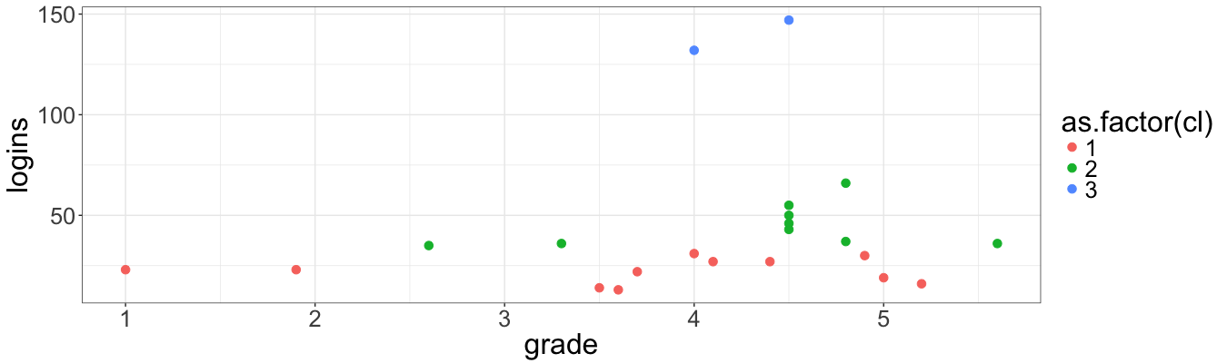
So far so good, but I am not very happy with such a result. The clusters are strongly dependent on the number of logins, but not on the midterm grade. Standardization of the values must solve this issue:
info$grade_std <- (info$grade - mean(info$grade)) / sd(info$grade)
info$logins_std <- (info$logins - mean(info$logins)) / sd(info$logins)

cl2 <- kmeans(x = info[, c("logins_std", "grade_std")], centers = 3)

info$cl2 <- cl2$cluster

ggplot(data = info,
       mapping = aes(x = grade, y = logins, color = as.factor(cl2))) +
    geom_point(size = 3)
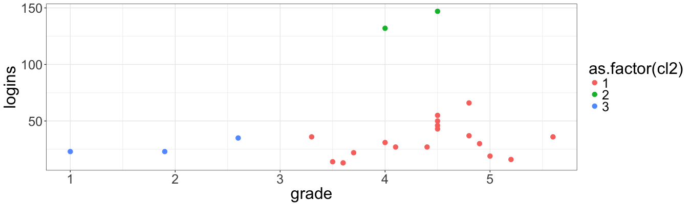
This chart looks nicer. Indeed, students are devided into three groups, namely: low (low number of logins and grades, middle number of logins and grades, high number of logins and grades).
Why all these are useful? Well, that’s why:
-
By looking at frequecny, it’s possible to judge which topics are difficult, or for instance, the overload of students, or even of the interest. This is a really true feedback.
-
Grouping students allows identifying those, who need an extra help and those who are a little bit more interested in the topic.
The source file is available at my gist.